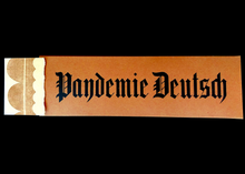
Pandemie Deutsch (Pandemic German)
by Amelia Hugill-Fontanel
2021
17" x 4.5"
17" x 4.5"
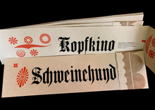
8 loose folded sheets - letterpress
inserted into handmade paper case
Edition of 13 copies
P22 Press – Rochester, New York
inserted into handmade paper case
Edition of 13 copies
P22 Press – Rochester, New York
Artist's Statement:
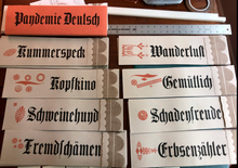
During winter 2021 of the Coronavirus Pandemic, I spent a lot of time cataloguing wood type in the RIT Cary Graphic Arts Collection. I organized a 14.5-line Textura-style blackletter typeface manufactured sometime in the 1890s by Heber Wells in New York. It had been donated to RIT by the family of Mo Lebowitz, a New York graphic designer. It is the Cary’s only complete font of blackletter wood type.I was typographically entranced with the typeface’s angles, long “s’s,” and many exotic ligatures. I wanted to honor its origins by printing something with it in German, as this type was surely manufactured for German-speaking immigrants to America. They had been prolific publishers in their new country, especially of newspapers. This type may have been used for headlines in broadsheets.Pandemie Deutsch or Pandemic German, highlights German words that have no English equivalent. These terms were applied to express my feelings while living through the quarantine. For example, the word “Kummerspeck” in German means “emotional overeating,” with a literal translation of “grief bacon.” “Kummerspeck” aptly described the comfort I derived from eating as stress-relief during uncertain times. To start my edition, I printed this and seven other uniquely German words using RIT’s evocative blackletter type. The text paper was Canal by Saint-Armand.Definitions were handset in Bauer Venus sans serif metal type, and printed in a separate run. The freestyle wood type ornaments were composed on the bed of the press and printed in orange. I next printed the scalloped border on the paper's deckle side. After drying, the pages were folded so that the German text is most visible. Opening the page reveals the English translation and my personal notes. All presswork was done using the Vandercook Universal 3 at P22 Type Foundry in Rochester, New York.The book’s oblong case was printed on Saint-Armand’s handmade colour paper. It was cut, scored, folded, and glued to create an edition of thirteen copies. The whole edition required 14 press runs.As we are emerging from a dark time in our shared global history, I realize that this work would not be possible without the forced isolation and downtime that the pandemic afforded. I am grateful for the diversion this work provided—when international problems seemed so bleak, I could find solace in solving problems on press.—Amelia Hugill-Fontanel, June 2021


